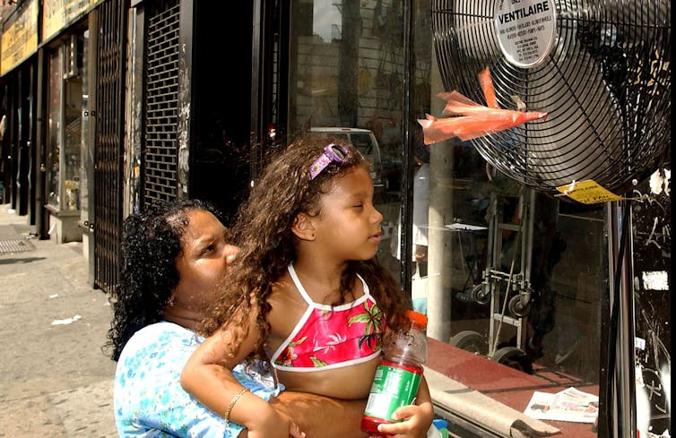
Satellites zoom in on cities’ hottest neighborhoods, some 10+ degrees hotter, to help combat the urban heat island effect
Spend time in a city in summer and you can feel the urban heat rising from the pavement and radiating from buildings. Cities are generally hotter than surrounding rural areas, but even within cities, some residential neighborhoods get dangerously warmer than others just a few miles away.
Within these “micro-urban heat islands,” communities can experience heat wave conditions well before officials declare a heat emergency.
I use Earth-observing satellites and population data to map these hot spots, often on projects with NASA. Satellites like the Landsat program have become crucial for pinpointing urban risks so cities can prepare for and respond to extreme heat, a top weather-related killer.
Among the many things we’ve been able to track with increasingly detailed satellite data is that the hottest neighborhoods are typically low-income and often have predominantly Black or Hispanic residents.
Two types of urban heat, both dangerous
The urban heat island effect was first described in 1818, over 200 years ago, in “The Climate of London” by Luke Howard, an early pioneer of meteorology.
There are two distinct types of urban heat island: the atmospheric urban heat island and the surface urban heat island. They are measured in different ways.
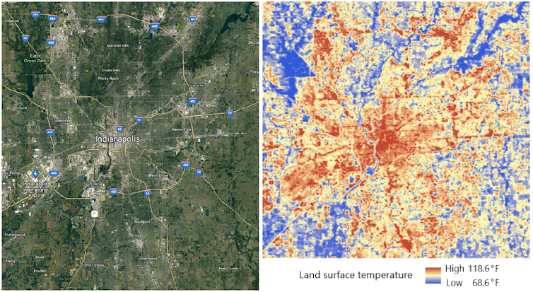
The atmospheric urban heat island, the phenomenon described by Howard, is simply the warmer air in urban areas relative to cooler air in outlying locations.
The surface urban heat island is the result of surfaces made up of heat-absorbing materials, such as asphalt, concrete and metal. Such materials are highly effective absorbers of heat energy from the Sun, and their surfaces warm rapidly and in turn emit the absorbed energy. You can feel the heat when you touch them.
The surface urban heat island directly contributes to the atmospheric urban heat island and is usually most intense on sunny days. Urbanization also contributes to the heat island effect through deforestation and the removal of other vegetation that would provide some cooling.
Where communities faces the highest heat
With rising global temperatures increasing the likelihood of dangerous heat waves, cities need to know which neighborhoods are at high risk. Excessive heat can lead to dehydration, heat exhaustion, heat stroke and even death with prolonged exposure, and the most at-risk residents often lack financial resources to adapt.
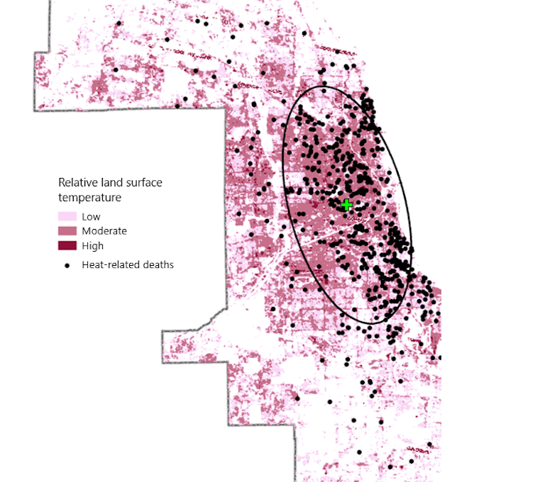
Satellite instruments can identify communities vulnerable to extreme heat because they can measure and map the surface urban heat island in high detail.
For example, industrial and commercial zones are frequently among the hottest areas in cities. They typically have fewer trees to cool the air and more pavement and buildings to retain and radiate heat.
Certain residential layouts are also more prone to higher surface temperatures than others. These neighborhoods usually have minimal vegetation, and homes are built close together, with more roads and sidewalks and little green space. Often, especially in northern climates, homes in these neighborhoods were built with materials such as brick that retain heat to keep occupants warmer in the winter. Communities with many apartment buildings and stores surrounded by parking lots are also at high risk.

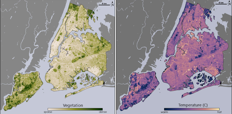
My research has found that on warm summer days, low-income communities of color can experience extreme heat conditions that are often more than 10 degrees Fahrenheit (5.5 C) warmer than surrounding areas. Other research has found similar differences among neighborhoods and stark racial and economic disparities when it comes to heat exposure.
One recent study found that the poorest areas were significantly hotter than the richest in 76% of urban U.S. counties. It also found that neighborhoods with large Black, Hispanic and Asian populations were in significantly hotter areas in 71% of counties, and that that difference remained even when adjusting for income. These areas tend to have less vegetation and a higher density of homes.
Another study looked at communities that had once been redlined, a discriminatory practice banks used in the early to mid-20th century to deny loans in racial and ethnic minority communities. Nationally, these formerly redlined neighborhoods were 4.6 F (2.6 C) warmer than nonredlined areas.
50 years of Landsat
Several satellite systems can now measure the surface urban heat island, but the Landsat program, which celebrates its 50th anniversary in 2022, provides decades of continuous, comparable data in the detail necessary to examine variations within a city. That continuity helps scientists measure the impact of changes and track how development patterns change a neighborhood’s heat profile.
The first Landsat satellite was launched on July 23, 1972, with a sensor that collected data in green, red and near-infrared wavelengths that made it useful for mapping vegetation. Beginning with Landsat 4, launched in July 1982, scientists could map and measure thermal characteristics of Earth’s surface. Today, Landsat 8 and Landsat 9 are operating, and a 10th is being developed.
How cities can use this data to help
There are numerous ways cities can use this data to help residents combat extreme heat.
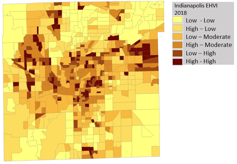
In Indianapolis, local government and faith-based organizations have used extreme heat vulnerability indices, which use indicators of heat-health risk and past heat waves to highlight high-risk communities. Knowing which communities are likely to be at the highest risk allows them to guide outreach to the most vulnerable people both before and during periods of elevated temperatures.
New York’s “Cool Neighborhoods NYC” program includes strategically planting trees and vegetation to increase shade and evapotranspiration, which cools the surrounding area. It also discusses painting roofs and pavement light colors to reflect solar energy and educating at-risk communities about heat risk and ways they can get help.
As the climate continues to warm and affect urban health, the Landsat satellites’ sensors are among our best tools for monitoring the thermal variations of the urban heat island. Such work also serves as one of the best examples of employing satellite-based measurements to monitor and implement response to public health threats.
Daniel P. Johnson, Associate Professor of Geography, IUPUI
This article is republished from The Conversation under a Creative Commons license. Read the original article.
https://ardelles.com/product/ap-collection-may-your-dreams-find-you-white-15oz-ceramic-mug/?swcfpc=1
